The color brown. What does it say to you? Do you like to look at it? Do you like to wear it?
For the last several years, brown has been everywhere on runways and in style guides. Clearly the color is having a moment.
In a Vox article written by Shira Tarlo (“Why brown is so on trend in fashion and design”), the author caught the trend in its early stages (2021). Tarlo attributes brown’s ascendance to our interest in minimalism, sustainability and natural beauty. The color “has quietly come of age … It’s a blatant foil to the perky, bright, and highly saturated shades that seeped into the worlds of fashion, advertising, and decor in recent years. But after [years] in which widespread disease, death, and social inequities tormented the global consciousness, leaning into muted colors may have only felt fitting.”
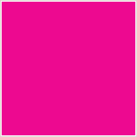
Fuchsia just wouldn't feel right in these times, would it?
In Western cultures, to varying degrees, brown’s positive representations are the Earth and nature, groundedness and comfort, autumn, sophistication, dependability, warmth, safety, nurturing, sobriety and interconnectivity. (“Exploring the Deeper Meaning Behind the Color Brown”)
We have come to 2025 and Pantone’s highly anticipated Color of the Year: Mocha Mousse. Does it sound delicious? Yes. Comforting? Probably. Is it exciting? Not so much. But it doesn’t take effort to see it’s a time for comfort, not excitement. It’s a time for mocha mousse, and shades of brown in general. Grab a chocolate truffle or a cafe latte (better yet, both) and settle in.
One hundred years of brown in fashion
Many sources point to the 1970s as the most recent big hurrah for brown, with the back-to-nature movement in full bloom. Still, I remember other eras and their unique takes on brown. I decided to crack open a few of my fashion history books and review the vintage clothing and accessories I have offered in shades of brown to try to spot some trends through time.
If I had to very briefly summarize the use of the color in each decade from the 1920s through the 1990s, I'd go with:
1920s: Punctuated by other colors and embellishments
1930s: Enlivened with metallic threads, sequins and beading
1940s: Used with purposeful seriousness
1950s: Incorporated with chic sophistication
1960s: Used to symbolize luxury—then earthiness
1970s: Lead the back-to-earth color movement
1980s: Reminded us of the 1940s and ’50s
1990s: Served as an alternate neutral

1920s silk cocoon coat with a magenta and gold jacquard lining; 1930s rayon evening dress and jacket with abstract silver lamé pattern; 1940s wool suit jacket and tilt hat; 1950s cotton eyelet sheath dress and leather pumps embossed with a lizard pattern; 1960s wool princess coat by Lilli Ann; 1970s gauze maxi dress by Denise Are There with floppy hat; 1980s rayon dress by Normal Kamali; 1990s linen jacket by Carole Little.
The 1920s and ’30s saw brown used as a casual, staple color, but it was most often paired with vibrant hues and elaborate embellishments for dressy occasions. Then the 1940s brought a seriousness to women’s clothing, as many women took to manufacturing jobs previously held by the men who had gone to war. Not only were somber colors (black, gray, maroon and navy, as well as brown) common, but it was a heyday for masculine influences in women’s fashion.

1940s suit jacket
With the renaissance of fashionability in the 1950s, there were many sophisticated color palettes involving brown. Brown plaids incorporated thin, bright-colored lines; fabric was printed in unprecedented color combinations including brown; and lustrous silks in brown shades ranging from near black to umber and cedar showcased brown’s elegance. Global influences incorporated into Western fashion introduced the browns of Hawaiian tapa, Indonesian batik and tooled leather from Mexico.

A typically interesting mix of colors was used for this ’50s abstract print

1950s batik-style print sheath; 1950s tooled leather pumps made in Mexico; 1960s tapa-style print Hawaiian shirt
In the late 1960s, luxury designer fashion in dark brown did its best to reflect back-to-the-earth hippies and bohemians. Saint Laurent certainly embraced brown and straddled the range of styles in that era. Well into the 1970s, the inspiration was earthy and grounded; the materials were wood, leather, suede and undyed natural fabrics.
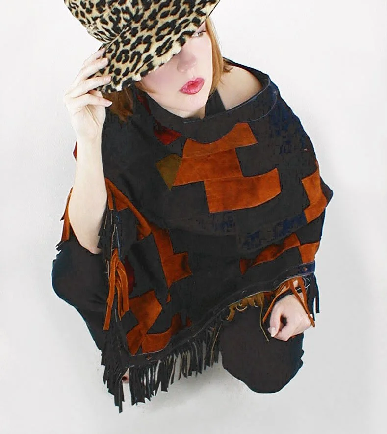
Patchwork suede poncho, c. 1971
Among other trends, the 1980s saw a yen for a return to high fashion, and this often took the form of 1940s and ’50s retro styles in many of the same shades as those used in prior decades. In the ’90s, black ruled, but one could be excused for wearing the occasional neutral dark brown.
Brown looks good with hair, eye and skin colors
No, not all browns look good with all colors, but I believe there is a good brown for every person. If you look good in cool colors (red, royal and emerald), try an espresso brown; if you look good in shades like olive green and terra cotta, try caramel brown. Hats and other accessories once made these color choices brilliantly obvious. (More on this in a moment.)
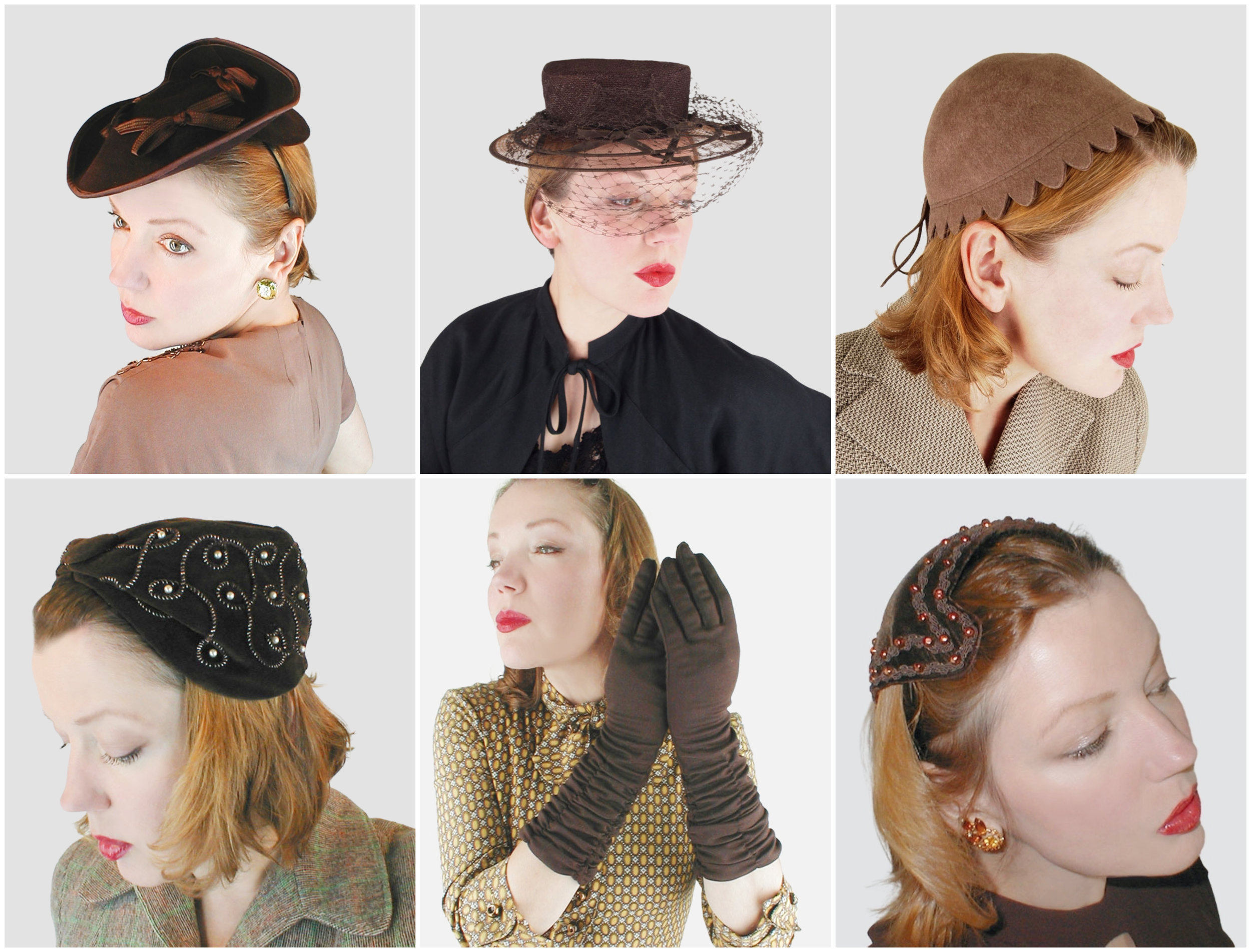
1930s tricorn silt hat by Helen Hale; 1940s brimmed hat by Shorlon; 1950s scalloped felt hat; 1950s beaded and embroidered velvet turban hat; 1950s ruched gloves by Hanson; 1950s beaded velvet half hat by Modern Miss
Brown when brown wasn’t enough
While in some eras the natural look of brown was touted, there were times when embellished brown was clearly the ideal. Iridescent taffeta, metallic threads, spectacular buttons, beading, braid… Here are some examples of brown getting a boost from extra ingredients during the late 1940s through the 1950s.

1950s iridescent taffeta and velvet dress; 1960s wool and metallic knit dress; 1950s sheath with large mirrored buttons; 1950s heavily beaded wool jacket by Don Loper; 1950s dress with gold braid by Natlynn Junior Originals; late 1940s to early ’50s beaded skirt suit by Ni-Nel
Some brown thematics
The most obvious association we make with brown is autumn, including colors and prints.

1960s reversible coat by Pendleton; 1950s brushed cotton dress and bag set by Serbin; 1970s suede shoes
Related is the proverbial last rose of summer. Usually these flowers are still blooming but are rendered in brown shades to imply the season’s end.

1950s outfit by Penelope’s of Honolulu; 1950s butcher linen dress; 1950s silk dress by Roseweb
Brown also seems to have been at home in modernist prints, echoing natural elements in mid-century interior design.

1960s linen jacket; 1960s belted shift dress; 1970s tunic by Vera; 1960s dress by Marjone
As for any color, dots lighten the mood of brown.

1970s blouse; 1960s mini dress; 1950s shirtwaist dress; 1970s smock
Illustrating natural themes is one of brown’s strongest suits.

1970s woodland animal print shirt by San Francisco Shirt Works; 1970s wrap dress by Mr. Suli; 1950s feather print set by Serbin; 1970s animal print scarf by Vera
Color combinations with brown
Cream with brown is a tried-and-true pairing.

1970s canvas coat with faux fur trim by White Stag; 1970s one-sleeve dress; 1950s dress by Prestige Junior; 1950s patio set by Jimmi Originals of Phoenix
The combination of brown and black offers a timeless elegance, perfect for creating sophisticated looks.

Late 1960s wool knit suit made in Italy by Gentucca; 1970s coat by Bromleigh; 1960s cotton eyelet set; 1950s hat and shawl set
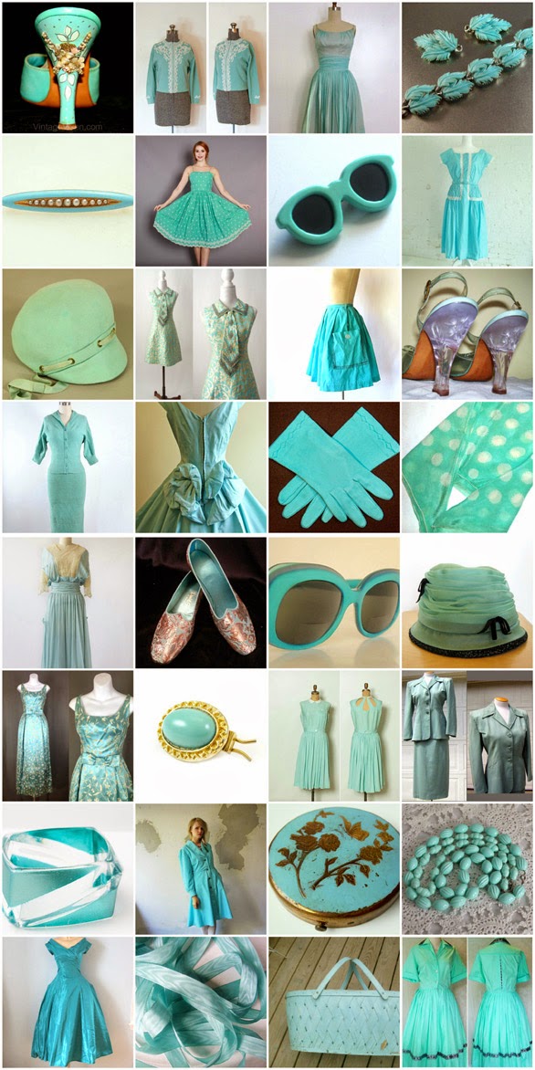
As we know from color theory, brown is uniquely blendable from various combinations of hues, leading to an extraordinary range of brown shades, and versatility in its ability to pair with colors from subtle to bright. Blues might not seem an obvious choice, but turquoise appears to be a brilliant shade with warm and dark browns.
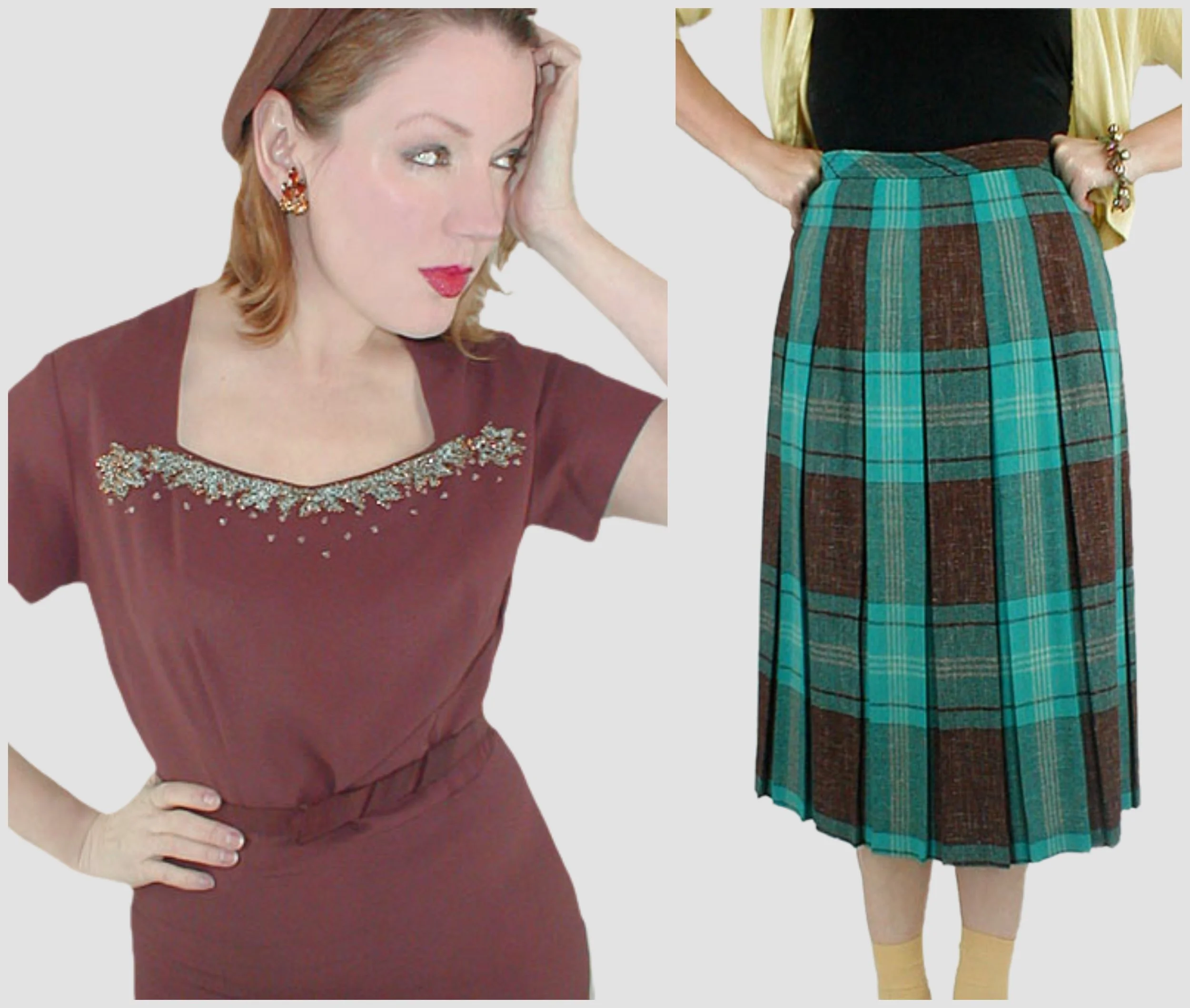
1940s-1950s velvet- and metal stud-embellished dress by C.H.D. Robbins; 1950s skirt by Koret of California
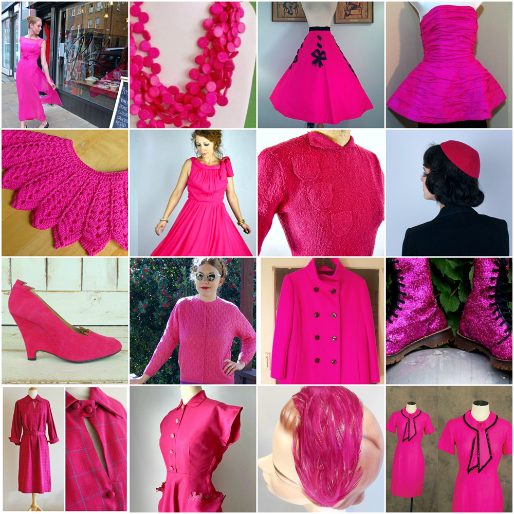
Then there is magenta—the perfect punctuation to a neutral brown.

1960s raincoat by Main Street
With its natural connection, green is a must. I love grass green with any brown, and lighter greens, like peridot and chartreuse, are also wonderful.

1940s suit; 1950s sundress; 1950s plissé dress by Queen Make Fashions; 1960s wool knit dress made in Hong Kong for Marshall Field
A bit less common are browns with pastel shades from pale yellow and pink to baby blue and lavender.

1960s velvet and satin mini dress; 1960s jacket from Saks Fifth Avenue
Great materials for brown
There are so many obvious material choices for the color brown. It is a natural in straw, cork, wood, leather and suede; makes perfect sense in faux fur and is sumptuous in velvet. Tweed lets the color get lively with specks of other shades. I also love it in luminous vintage plastics—so often in a shade described as “root beer.” Here’s another choice, and it might surprise you: lace. That it is not expected heightens its allure. The same could be said for satin in brown.

1960s wicker and leather bag from Hong Kong; 1960s faux fur capelet; 1970s straw hat by Beresford; 70s fringed suede jacket by Ms. Pioneer; 1950s plastic handbag; 1970s velvet wrap coat by David Hayes; 1950s sheath dress; 1950s English-made tweed swing coat; 1960s leather handbag
Everyone has a good brown
Do you remember those color seasons, such as cool winter and warm autumn? If you're curious, there are many webpages that help you find your season.

Previously found at: https://spottedline.com/color-seasons/

Image by denisebrain (using AI). Try various browns with your own coloring—I guarantee there is one (or more) that is good for you.
Autumns are shoo-ins for a range of browns, but take a close look and you will see some sort of brown in each group. Its ability to complement a diverse range of skin tones makes it an inclusive choice.
I’m down with brown
As a vintage fashion dealer, I see firsthand how this hue can beautifully complement a myriad of styles and tonal palettes. In a time marked by a yearning for authenticity and sustainability, brown represents a genuine comfort. Let’s honor the depth and versatility of this hue, embracing its ability to connect us to the past while making a bold statement in the present.
Is there a best brown for you to wear? Do any eras’ uses of brown inspire you most?